
Skip to content
Email: info@acanex.com
Login/Register
Teach on acanex
acanex.comacanex.com
  • Category
    • SEO & Marketing
  • Home
  • All Courses
  • Intructors
  • Pages
    • Dashboard
    • Blog
    • About Acanex
    • Contact Us
0

Currently Empty: CFA0.00


Continue shopping

Register as student
acanex.comacanex.com
  • Home
  • All Courses
  • Intructors
  • Pages
    • Dashboard
    • Blog
    • About Acanex
    • Contact Us

From Distraction to 100% Distinction: Mastering Digital Learning in 2026

  • Home
  • Blog
  • From Distraction to 100% Distinction: Mastering Digital Learning in 2026
Breadcrumb Abstract Shape
Blog

From Distraction to 100% Distinction: Mastering Digital Learning in 2026

  • August 3, 2026
  • Com 0
Smiling Black female student in a smart light-green outfit standing with a tablet beside the title “From Distraction to 100% Distinction: Mastering Digital Learning in 2026

From Distraction to 100% Distinction
Create a clean full-bleed infographic illustration in 3:2 aspect ratio with a modern professional style. Use a light background with subtle blue and teal gradient accents, crisp sans-serif typography, and strong visual hierarchy.

Place a large bold heading at the top center with the exact text: "Introduction"

Below the heading, create a wide horizontal layout with three evenly spaced feature blocks across the center:
1. Left block: a blue circular icon with a simple open book symbol, label beneath in bold text: "Overview"
2. Center block: a teal circular icon with a lightbulb symbol, label beneath in bold text: "Key Ideas"
3. Right block: a navy circular icon with a forward arrow symbol, label beneath in bold text: "What’s Next"

Add thin connecting lines between the three blocks to suggest flow. Use clean white cards with soft shadows behind each block. Keep the composition spacious, balanced, and readable, with no vertical poster framing and no inset margins.

From Distraction to 100% Distinction: Mastering Digital Learning in 2026

From Distraction to 100% Distinction: Mastering Digital Learning in 2026

AI is everywhere in 2026 — inside your LMS, your browser, your slide deck, and probably your to-do list. But more tools don’t automatically mean better learning. For L&D professionals, instructional designers, and educators who want real results, the challenge right now isn’t finding AI-powered learning tools — it’s knowing how to use them without losing what actually makes learning stick.

This post is for learning teams ready to stop experimenting randomly and start building something that works. If you’re designing courses, managing digital programs, or trying to get your organization genuinely skilled up — not just certified — this is where to focus your energy.

Here’s what we’ll cover:

  • Why digital learning strategies in 2026 need to shift from AI hype to intentional practice — and what that looks like day-to-day
  • How to redesign assessment so learners can’t just hand the work off to a chatbot — and actually prove what they know
  • What a sustainable digital learning strategy looks like when budgets tighten and the tooling keeps changing

Let’s get into it.

The Shift from AI Hype to Strategic Digital Learning
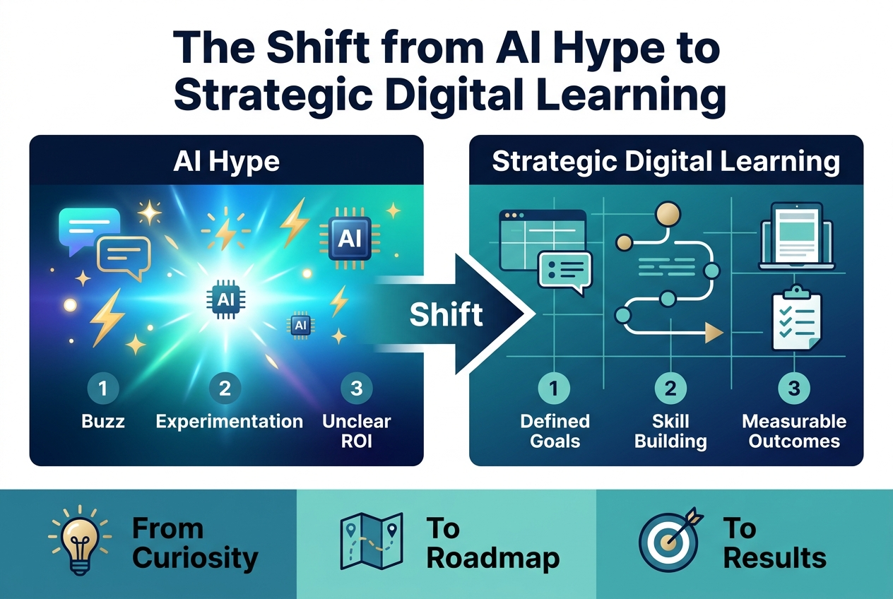
Create a full-bleed professional infographic in a 3:2 aspect ratio with a wide horizontal layout, clean modern sans-serif typography, and a polished corporate color palette of deep navy, teal, white, and subtle gold accents.

Top center: large bold title in dark navy text, exact wording: "The Shift from AI Hype to Strategic Digital Learning"

Below the title, arrange a left-to-right transition graphic across the center of the canvas with two large side-by-side panels connected by a thick arrow.

Left panel: labeled with a bold header, exact text: "AI Hype"
Use a bright electric gradient background with energetic glow effects, abstract chat bubbles, spark icons, lightning bolts, and floating AI chip symbols.
Add three numbered mini points with small circular icons:
1. "Buzz"
2. "Experimentation"
3. "Unclear ROI"

Center: a large right-pointing arrow labeled in bold: "Shift"

Right panel: labeled with a bold header, exact text: "Strategic Digital Learning"
Use a calm structured background in teal and deep blue with organized grid lines, a learning path diagram, a tablet or laptop icon, and a checklist symbol.
Add three numbered mini points with clean icons:
1. "Defined Goals"
2. "Skill Building"
3. "Measurable Outcomes"

Bottom band spanning the full width: three evenly spaced blocks with icons and short labels.
Left block: an eye-catching icon of a light bulb with exact text: "From Curiosity"
Middle block: an icon of a roadmap with exact text: "To Roadmap"
Right block: an icon of a target with exact text: "To Results"

Use clear visual hierarchy, bold section headers, strong contrast, neat alignment, and spacious wide composition with no vertical poster framing.

Why 2026 Is the Year of Outcomes Over Novelty

If 2024–25 were the years of “try everything,” 2026 is where learning teams get strategic, human, and measurable. The conversation has decisively shifted from chasing novelty to delivering outcomes:

  • Credible, high-quality content
  • Authentic assessment
  • Accessible learning experiences
  • Change that actually sticks

Digital learning strategies 2026 are no longer defined by what’s new — they’re defined by what works.

How AI Has Become Embedded in Every Learning Tool

AI in education has moved well beyond optional add-ons. Today, it’s infused into nearly every tool learning teams touch — what some describe as the “Clippy-on-steroids” phase, where every app opens by asking how its AI can help.

This saturation means AI-powered learning tools are no longer a differentiator. They’re the baseline.

Moving from Experimentation to Intentional Design

With this in mind, the critical lesson for L&D professionals is intentionality. When every team experiments differently — with no shared direction — momentum fractures and trust erodes.

Mastering online learning in this environment requires moving from scattered pilots to purposeful, coordinated design. Consistent frameworks replace one-off experiments, ensuring that AI adoption builds cumulative progress rather than isolated noise.

Using AI as a Power Tool, Not an Autopilot
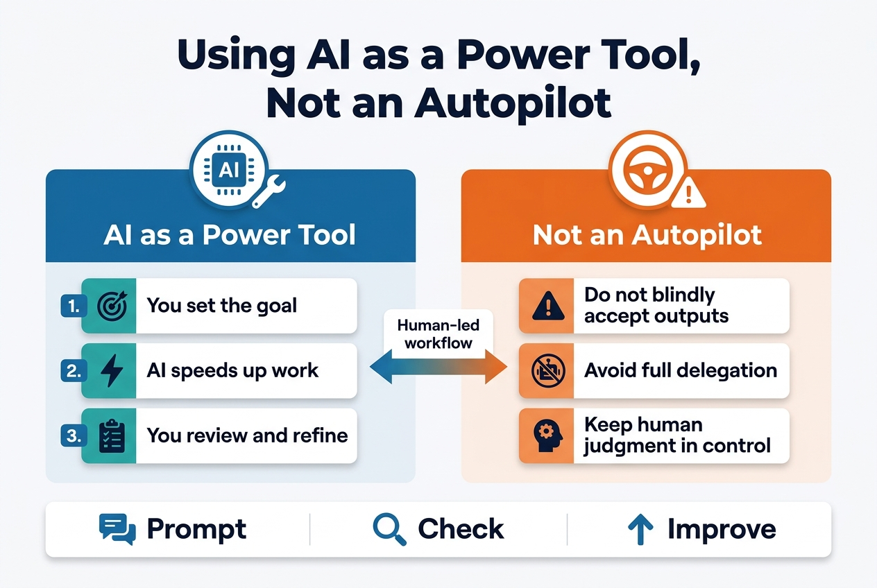
3:2 aspect ratio, full-bleed professional infographic with a clean modern tech style, white background with deep blue, teal, and orange accents, bold sans-serif typography.

Top center: large bold heading in dark navy text, exactly: "Using AI as a Power Tool, Not an Autopilot"

Below the heading, create a wide two-column comparison layout across the center of the canvas:

Left column: a blue panel with a circular AI chip icon and wrench icon at the top, title text: "AI as a Power Tool" in white bold text. Under it, three short numbered blocks with small icons:
1. "You set the goal" with a target icon
2. "AI speeds up work" with a lightning bolt icon
3. "You review and refine" with a checklist icon

Right column: an orange panel with a circular steering wheel icon and warning triangle icon at the top, title text: "Not an Autopilot" in white bold text. Under it, three short numbered blocks with small icons:
1. "Do not blindly accept outputs" with a caution icon
2. "Avoid full delegation" with a crossed-out robot icon
3. "Keep human judgment in control" with a human head and gear icon

Center between the columns: a horizontal arrow pointing from left to right with a small label above it, exactly: "Human-led workflow"

Bottom section spanning the width: a clean three-step strip with icons and short labels:
"Prompt" with a chat bubble icon
"Check" with a magnifying glass icon
"Improve" with an upward arrow icon

Use clear visual hierarchy, strong spacing, crisp vector shapes, subtle shadows, and balanced wide composition with no vertical poster framing.

How Mainstream Tools Like NotebookLM Are Transforming Practice and Feedback

NotebookLM’s recent updates—mind maps, quizzes, and comprehension checks—have quietly repositioned it as a robust practice and feedback engine. For digital learning strategies in 2026, this means learners gain structured reinforcement without requiring custom-built infrastructure.

Leveraging AI for Faster Scenario Creation and Multilingual Content

AI-powered learning tools like Runway and HeyGen are compressing production timelines dramatically:

  • Video scenario generation produces lifelike learning prompts in hours, not weeks
  • Voice and translation tools deliver multilingual content assets at scale
  • Realistic contexts improve learner engagement and situational authenticity

This acceleration directly supports mastering online learning across diverse, global audiences.

Building an AI Adoption Playbook with Clear Roles and Guardrails

Treating GenAI as a power tool, not an autopilot, requires deliberate governance. A structured AI adoption playbook should define:

Element Purpose
Roles Clarify who creates, reviews, and approves AI outputs
Policies Establish ethical and instructional boundaries
Approval paths Ensure quality and compliance checkpoints
Minimal viable stacks Standardize trusted tools across teams

With this in mind, consistent guardrails keep AI in trained hands—building an approach that is both innovative and trustworthy.

Making Change Management the Engine of AI Success
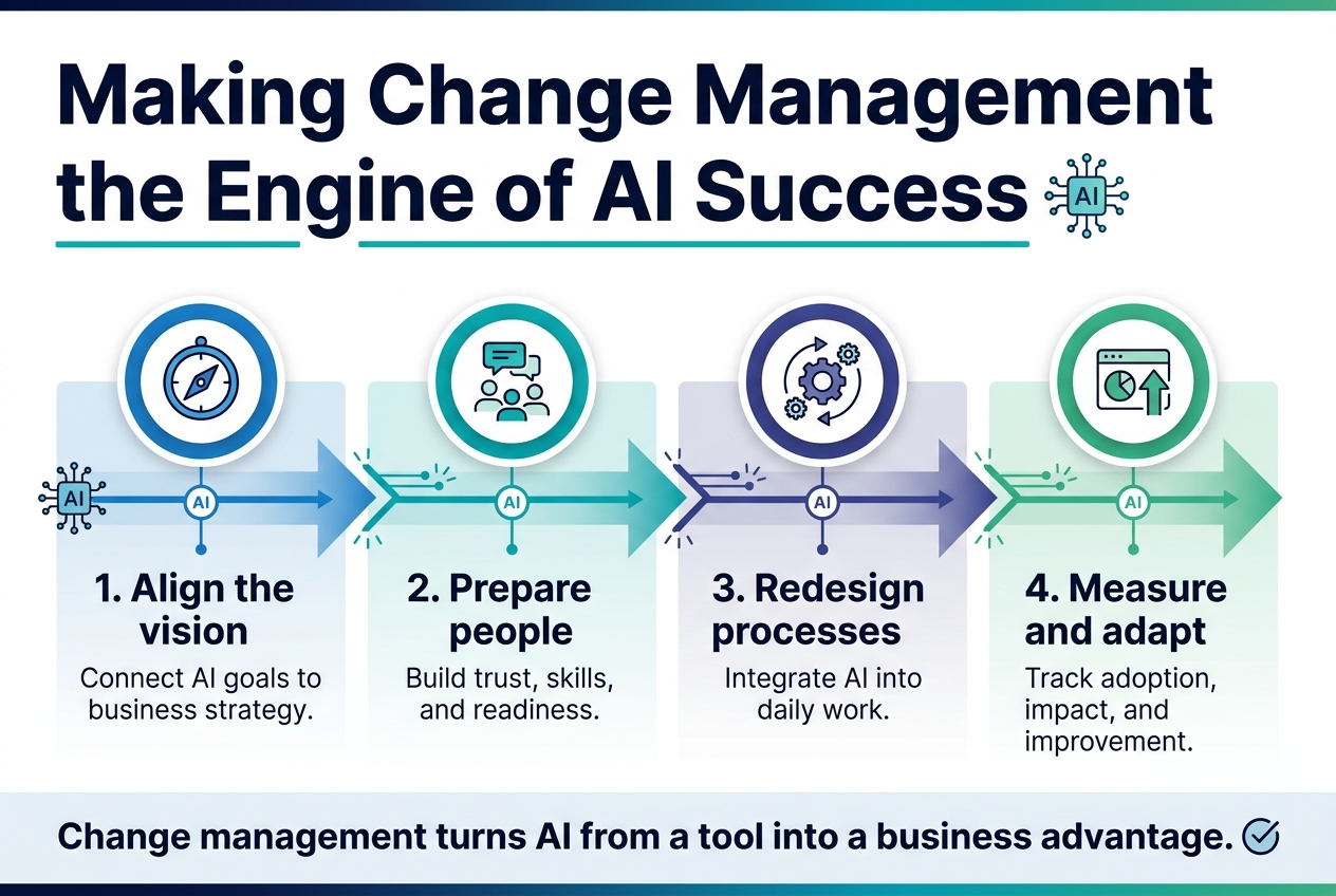
Full-bleed professional infographic, aspect ratio 3:2, clean modern corporate style, white background with deep navy, teal, and blue accents, subtle gradient highlights, sans-serif fonts with strong hierarchy.

Top wide header across the full width: bold title in large dark navy text, exact text: "Making Change Management the Engine of AI Success". Add a thin teal underline and a small AI circuit icon beside the title.

Below the header, create a horizontal 4-step process with four equal blocks across the page, each with a numbered circle icon and a simple illustration symbol:

1) Left block: blue circular icon with a compass and target symbol. Heading text: "1. Align the vision". Smaller subtext: "Connect AI goals to business strategy."

2) Second block: teal circular icon with people and chat bubbles. Heading text: "2. Prepare people". Smaller subtext: "Build trust, skills, and readiness."

3) Third block: indigo circular icon with gears and workflow arrows. Heading text: "3. Redesign processes". Smaller subtext: "Integrate AI into daily work."

4) Right block: green circular icon with a dashboard and upward arrow. Heading text: "4. Measure and adapt". Smaller subtext: "Track adoption, impact, and improvement."

Add a wide central visual band behind the four blocks showing a flowing arrow or connected pathway from left to right, with small AI nodes and transformation spark lines along the path.

Bottom footer strip across the full width with a highlighted statement in bold navy text: "Change management turns AI from a tool into a business advantage." Add a small checkmark icon at the end.

Use clear spacing, strong alignment, balanced horizontal composition, no vertical poster layout, no inset frame, no extra text.

Why Organizations That Run Change Outperform Those That Just Run Tools

After a year of enterprise AI work, one pattern is undeniable: winning organizations aren’t simply deploying tools — they’re running structured change. That distinction separates meaningful outcomes from expensive experiments.

Success begins with role analysis — identifying who does what and where AI can safely augment human work before any tool goes live.


Building AI Literacy Frameworks Across Your Learning Team

With this in mind, a robust AI literacy framework becomes your foundation. Effective frameworks anchor around:

  • Responsible AI and ethics
  • Data use and policy-in-course
  • Prompt crafting skills
  • Critical evaluation of AI outputs
  • Accessibility awareness

These aren’t optional modules — they’re the skills framework every learning team needs to adopt change management in e-learning as a genuine discipline, not a checkbox exercise.


Designing Learning for the Flow of Work, Not Just the Course Shell

Previously, learning lived inside the LMS. Now it’s happening across Teams, Slack, and social spaces too.

Digital learning strategies 2026 must reflect ecosystem thinking — designing for where work actually flows, not just where courses are hosted. Learning needs to meet people in the moments that matter most.

Redesigning Assessment for Authenticity and Integrity
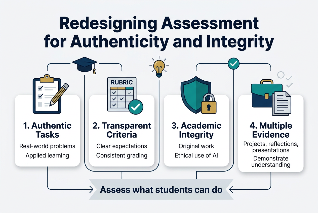
Full-bleed 3:2 infographic illustration, clean modern professional style, white background with deep navy, teal, gold, and light gray accents, bold sans-serif typography. Large heading at the top centered: "Redesigning Assessment for Authenticity and Integrity". Beneath the heading, a wide horizontal 4-block layout across the page with clear icons and short labels in each block.

Left block: a clipboard and pencil icon, title text "1. Authentic Tasks", with smaller text "Real-world problems" and "Applied learning".
Second block: a rubric and checkmark icon, title text "2. Transparent Criteria", with smaller text "Clear expectations" and "Consistent grading".
Third block: a shield and lock icon, title text "3. Academic Integrity", with smaller text "Original work" and "Ethical use of AI".
Right block: a portfolio and document stack icon, title text "4. Multiple Evidence", with smaller text "Projects, reflections, presentations" and "Demonstrate understanding".

Add a subtle center-bottom banner with a connected arrow flow linking the four blocks to a final highlighted message: "Assess what students can do". Use thin connecting lines, rounded cards, balanced spacing, and strong visual hierarchy. Include small decorative academic icons such as a graduation cap, lightbulb, and checkmarks. No border frame, no narrow vertical stack, no extra text.

Why Traditional Quizzes and Essays Are No Longer Enough

Agentic browsers and generative AI tools have made the classic “seven modules of MCQs plus an essay” format obsolete. With AI capable of drafting polished responses in seconds, assessment integrity demands a fundamental redesign toward task-based, social, and reflective formats that genuinely reveal learner capability.

Teach-Back, Case Debates, and Portfolio Evidence as Effective Alternatives

Authentic assessment strategies worth adopting include:

  • Teach-back assessments – Learners select a concept early, then teach it live or via video, fielding peer Q&A and critiquing AI-suggested content
  • Case debates and role-plays – Team-based positions with rotating roles and reflective submissions documenting what peers argued and how decisions evolved
  • Portfolio evidence – Real or simulated work artifacts with traceable iterations showing AI’s contributions alongside the learner’s rationale

Designing Assessments That Show Learner Thinking and AI Transparency

With this in mind, effective prompts make thinking visible:

> “Show the steps you took, what AI suggested, what you kept or changed, and why. Reference at least one peer’s feedback.”

> “Record a 3-minute debrief explaining how you validated facts, including what an expert corrected.”

These approaches embed AI transparency directly into the authentic assessment strategies themselves.

Re-Centering Subject Matter Experts in an AI-Driven World
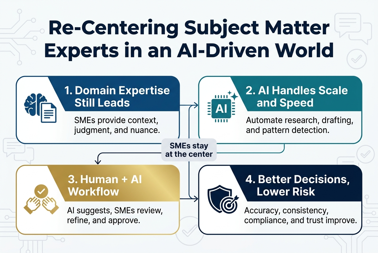
Create a full-bleed horizontal infographic in a 3:2 aspect ratio with a clean modern corporate style, white background, deep navy and teal palette with gold accents, bold sans-serif typography, and strong visual hierarchy.

Top center large bold heading: "Re-Centering Subject Matter Experts in an AI-Driven World"

Below the heading, arrange four wide horizontal numbered sections across the canvas in a 2x2 grid, each section in a rounded rectangle with a simple icon and short text.

Section 1, top left: a blue brain and document icon. Title text: "1. Domain Expertise Still Leads". Body text: "SMEs provide context, judgment, and nuance."

Section 2, top right: a teal AI chip and spark icon. Title text: "2. AI Handles Scale and Speed". Body text: "Automate research, drafting, and pattern detection."

Section 3, bottom left: a gold collaboration icon with two hands and a checkmark. Title text: "3. Human + AI Workflow". Body text: "AI suggests, SMEs review, refine, and approve."

Section 4, bottom right: a navy shield and target icon. Title text: "4. Better Decisions, Lower Risk". Body text: "Accuracy, consistency, compliance, and trust improve."

Add a slim connecting line or arrow path between the four sections to show an end-to-end workflow. Place a small center label between the sections: "SMEs stay at the center". Include subtle background graphics of circuit lines, speech bubbles, and checkmarks at low opacity. Use clear spacing, aligned edges, and a polished editorial infographic look.

What AI Cannot Replace: Credibility, Context, and Lived Judgment

AI can draft competent content, but it cannot fabricate credibility, context, or lived judgment. That gap is precisely where the Subject Matter Expert’s (SME) new value proposition lives. In AI-powered learning tools, the SME becomes the irreplaceable human anchor.

Shifting SMEs from Content Creators to Curators and Checkpoint Coaches

With this in mind, the SME role must evolve from building content from scratch to curation and critique. Key responsibilities shift to:

  • Providing just-in-time interventions inside simulations and role-plays where nuance matters most
  • Applying context stamps — answering, “What would actually happen here, at our company, in our market, with our constraints?”

This positions SMEs as strategic validators rather than production resources.

A Practical SME Model That Maximizes Impact in Minimal Time

Now that we’ve covered the SME’s evolved role, here’s a high-impact model that respects their time:

Phase Activity
Pre-Work AI-assisted; learners consume materials and generate questions
Simulation Conversational AI or video-driven scenario
SME Checkpoint 15–30 minutes of targeted feedback on decisions and alternatives
Evidence Pack Documents evolution from first draft to SME-informed decisions

This structure maximizes SME impact within minimal time investment.

Evolving Micro-Credentials into Stackable, Applied Pathways
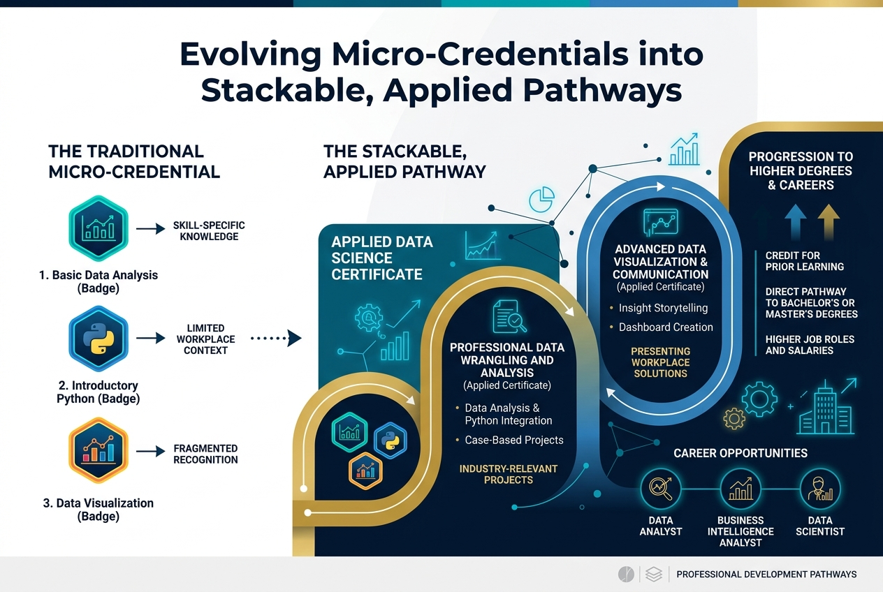
Full-bleed 3:2 landscape infographic, clean professional style, white background with deep navy, teal, blue, and gold accents, modern sans-serif typography. Large bold heading across the top center: "Evolving Micro-Credentials into Stackable, Applied Pathways". 

Below the heading, create a wide horizontal 4-step flow from left to right with connected arrows, using large numbered circular markers and simple icons in each section:
1. Left section: small credential badge icons, label in a bold subheading: "Micro-Credentials", with supporting text: "Short, focused learning units" and "Skills-specific".
2. Second section: stacked modular blocks, label: "Stackable", with supporting text: "Combine multiple credentials" and "Build toward larger qualifications".
3. Third section: pathway map icon with branching nodes, label: "Applied Pathways", with supporting text: "Organized into learning routes" and "Aligned to real-world skills".
4. Right section: graduation cap and briefcase icon, label: "Career Outcomes", with supporting text: "Industry-ready competencies" and "Job-relevant advancement".

Add a slim bottom band spanning the width with three small callout blocks and icons: checkmark icon with "Flexible", puzzle piece icon with "Portable", target icon with "Career-Aligned". Use subtle light gray separators, crisp icon outlines, strong visual hierarchy, ample spacing, and balanced multi-column layout. No frame border, no poster border, no vertical stack.

Why Many Micro-Credentials Have Fallen Short and How to Fix Them

Many micro-credentials have been underspecified — built on weak definitions, thin experiences, and vague outcomes. In 2026, a meaningful reset is underway, shifting toward:

  • Authentic, applied assessment replacing quizzes at scale
  • Industry co-design embedded early in credential development
  • AI transparency built directly into assessment rubrics

Aligning Credentials to Real Job Outputs and Industry-Co-Designed Competencies

With this in mind, the credibility of micro-credentials in digital learning strategies 2026 depends entirely on evidence alignment. Credentials must map to real job outputs — the deliverables that employers and stakeholders actually value — not abstract learning objectives.

Old Approach Evolved Approach
Vague outcome statements Job-linked competencies
Generic assessments Industry co-designed rubrics
Isolated knowledge checks Applied, transferable evidence

Giving Learners a Visible Stacking Map from Day One

Stackable learning only delivers value when learners can see the path clearly. Institutions should provide a transparent stacking map from day one, showing how 5, 10, or 20 credit chunks progressively aggregate toward recognized awards. This visibility transforms micro-credentials from isolated certificates into coherent, motivating applied learning pathways.

Making Digital Accessibility a Default, Not an Afterthought
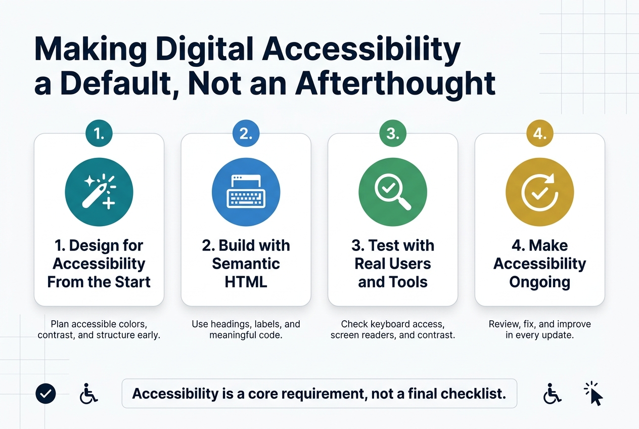
Create a clean professional infographic in a 3:2 landscape aspect ratio with a full-bleed layout, white background, deep navy and teal color palette, subtle light-gray grid accents, and modern sans-serif typography. Place a bold top heading across the upper left: "Making Digital Accessibility a Default, Not an Afterthought". 

Below the heading, use a wide horizontal 4-step layout with four evenly spaced sections across the center of the canvas, each in a rounded rectangle card with a distinct icon and short label. Use numbered circles above each card title.

Section 1 on the left: a teal circle icon with a spark/plus symbol, title text: "1. Design for Accessibility From the Start", with a small subtitle: "Plan accessible colors, contrast, and structure early."  
Section 2 left-center: a blue circle icon with a keyboard and screen, title text: "2. Build with Semantic HTML", with a small subtitle: "Use headings, labels, and meaningful code."  
Section 3 right-center: a green circle icon with a magnifying glass and checkmark, title text: "3. Test with Real Users and Tools", with a small subtitle: "Check keyboard access, screen readers, and contrast."  
Section 4 on the right: a gold circle icon with an arrow looping back into a checkmark, title text: "4. Make Accessibility Ongoing", with a small subtitle: "Review, fix, and improve in every update."  

Add a small bottom banner spanning the width near the lower edge with bold text: "Accessibility is a core requirement, not a final checklist." Include small minimalist icons near the banner: a checkmark, a wheelchair accessibility symbol, and a cursor pointer. Keep the composition balanced, wide, and uncluttered, with clear hierarchy and strong spacing.

Why Accessibility Is the Top In-Demand Digital Learning Skill for 2026

Digital accessibility tops the list of most requested skills heading into 2026, according to ALT (Association for Learning Technology) events. As digital learning strategies 2026 evolve, accessibility is no longer optional — it’s a professional baseline.

Using AI-Powered Tools to Catch and Fix Accessibility Issues Early

AI won’t automatically solve accessibility challenges, but it significantly lowers the friction of doing it properly. AI-powered learning tools can flag common issues early, including:

  • Contrast ratios that fail readability standards
  • Missing or poor alt text on images
  • Caption quality in video content
  • Document structure that breaks screen reader navigation

Catching these issues at the design stage — not after launch — saves time and protects learner inclusion.

Building Multimodal Options and Validating Translations with Human Review

With this in mind, the next step is building multimodal options by default, ensuring every learner has a pathway that works for them:

  • Transcripts for audio and video content
  • Concise one-pagers for complex materials
  • Narrated explainers for visual learners

When scaling across languages, automated translation must be validated through human review, particularly where cultural nuance or domain-specific precision is critical to learning integrity.

Protecting Human Connection in an AI-Saturated Learning Environment
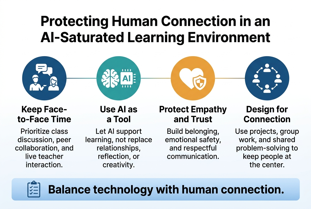
3:2 full-bleed professional infographic, clean modern style, white background with deep blue, teal, and warm orange accents, bold sans-serif typography.

Top center large bold heading: "Protecting Human Connection in an AI-Saturated Learning Environment"

Below the heading, a wide 4-column horizontal layout with four equal sections, each with a colored circular icon above a short title and 2-line body text.

Section 1 on the left: icon of two people talking with speech bubbles, title in bold: "Keep Face-to-Face Time", body text: "Prioritize class discussion, peer collaboration, and live teacher interaction."

Section 2 left-center: icon of a brain and AI chip side by side, title in bold: "Use AI as a Tool", body text: "Let AI support learning, not replace relationships, reflection, or creativity."

Section 3 right-center: icon of a heart and shield, title in bold: "Protect Empathy and Trust", body text: "Build belonging, emotional safety, and respectful communication."

Section 4 on the right: icon of a classroom circle with connected dots, title in bold: "Design for Connection", body text: "Use projects, group work, and shared problem-solving to keep people at the center."

Along the bottom, a wide highlighted banner with a subtle blue gradient and a checklist icon on the left, containing the text in bold: "Balance technology with human connection."

Use clear visual hierarchy, ample spacing, crisp flat vector icons, subtle lines connecting the four sections, and a polished educational editorial infographic look.

Why Community and Social Learning Still Drive Behavior Change

AI can personalize content and simulate dialogue, but it cannot replicate the accountability and motivation that come from learning alongside peers. Community changes behavior in ways that solo AI interactions simply cannot. While traditional LMS forums have historically struggled to generate genuine engagement, the need for social learning remains stronger than ever in human connection in AI learning environments.

Designing Social Learning Where Learners Already Spend Their Time

With this in mind, the solution is to meet learners where they already are. Shift discussions and collaborative moments into Teams or Slack channels using light, consistent structure:

  • Weekly work-in-progress threads
  • Peer boost shout-outs
  • Short video check-ins

Critically, tie every social interaction to an evidence artifact, so conversations produce tangible learning outputs rather than disappearing into a feed.

Creating On-Ramps That Include Quieter and Less Confident Contributors

Not every learner thrives in open group debate. Sustainable digital learning strategies must design entry points for all participation styles. Effective on-ramps include:

  • Reaction prompts and quick polls
  • Micro-reflections before full group sharing
  • Pair-and-share structures that build confidence before broader discussion

These approaches ensure every voice contributes meaningfully, not just the loudest ones.

Building a Sustainable and Resilient Digital Learning Strategy
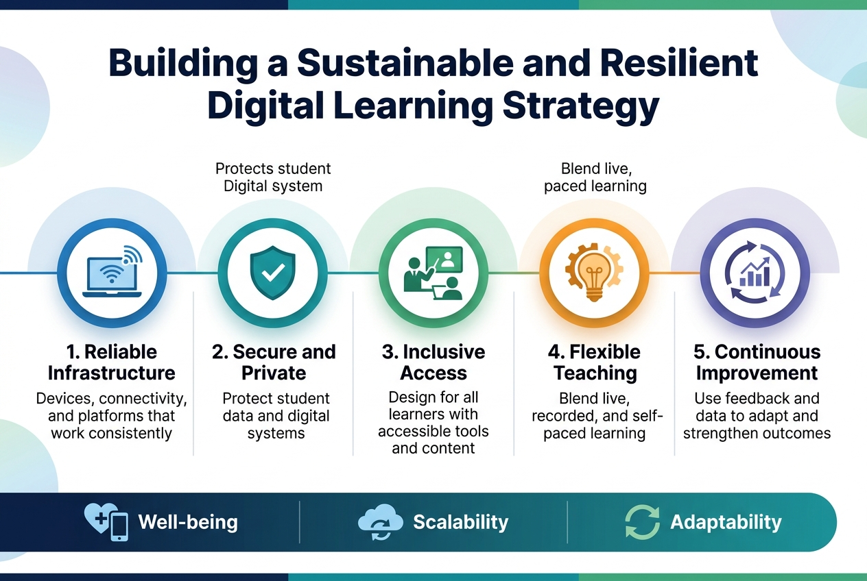
Create a clean, professional full-bleed infographic in a 3:2 aspect ratio with a modern flat-design style, no outer frame, no inset margins, and a wide horizontal layout. Use a deep navy, teal, green, and light blue color palette with white background accents and subtle gradient shapes. Use bold sans-serif typography for the heading and clear readable sans-serif body text.

Top center: large bold heading in dark navy text:
"Building a Sustainable and Resilient Digital Learning Strategy"

Below the heading, arrange five wide horizontal sections across the middle of the canvas in a connected flow or roadmap layout, each with a numbered circle, a distinct icon, and short label text. Use consistent spacing and visual hierarchy.

Section 1 on the left: blue circular icon with a laptop and Wi‑Fi signal. Text:
"1. Reliable Infrastructure"
"Devices, connectivity, and platforms that work consistently"

Section 2 next to it: teal circular icon with a shield and checkmark. Text:
"2. Secure and Private"
"Protect student data and digital systems"

Section 3 in the center: green circular icon with a teacher and student connected by a screen. Text:
"3. Inclusive Access"
"Design for all learners with accessible tools and content"

Section 4 next: orange circular icon with a lightbulb and gears. Text:
"4. Flexible Teaching"
"Blend live, recorded, and self-paced learning"

Section 5 on the right: purple circular icon with a circular arrow and analytics chart. Text:
"5. Continuous Improvement"
"Use feedback and data to adapt and strengthen outcomes"

Add a bottom wide banner with three small icon callouts spaced evenly, each with short text:
left: heart plus device icon with text "Well-being"
center: cloud sync icon with text "Scalability"
right: refresh arrows icon with text "Adaptability"

Use subtle connecting lines between sections, minimal shadows, crisp vector shapes, and a polished corporate education infographic aesthetic. Ensure all text is sharp, legible, and exactly as written.

A. Navigating the Financial and Environmental Costs of Large-Scale AI

The growing unease around AI’s cost and environmental footprint is hard to ignore. A sustainable digital learning strategy prioritizes process improvements over flashy AI outputs. When budgets tighten—and they will—organizations focused on efficiency rather than novelty stay resilient.

B. Choosing Interoperable Tools That Protect Your Content Investment

With this in mind, tool selection becomes a strategic decision, not just a technical one. Build your sustainable digital learning strategy around:

  • Interoperable platforms that communicate across systems
  • Source-of-truth content kept decoupled from any single vendor
  • Flexibility to migrate without losing your content investment

Vendor lock-in is one of the biggest risks in AI-powered learning environments. Protecting your content architecture ensures long-term resilience regardless of market shifts.

C. Teaching AI-Critical Thinking So Learners Thrive Through Any Tool Change

Now that we’ve addressed infrastructure, the human layer matters just as much. Tools will change—guaranteed. What endures is a learner’s ability to evaluate, question, and adapt.

Teaching AI-critical thinking equips learners to:

  • Assess AI outputs rather than accept them blindly
  • Transfer skills across different platforms and toolsets
  • Remain effective even when the technology underneath them shifts

Human adaptability is the most future-proof investment in any digital learning strategy.

Turning Every Day into a Digital Learning Opportunity
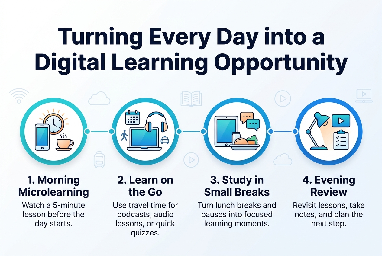
Create a clean full-bleed infographic in 3:2 aspect ratio with a modern professional flat vector style, bright blue, teal, white, and soft orange color palette, subtle gradients, crisp line icons, and strong visual hierarchy. Place a bold top heading across the upper third in dark navy sans-serif text: "Turning Every Day into a Digital Learning Opportunity".

Use a wide horizontal layout with four evenly spaced numbered sections across the middle and lower area, not a vertical poster. Each section should have a circular icon, a short title, and one brief supporting line.

Section 1 on the left: a sunrise clock, smartphone, and coffee cup icon. Title text: "1. Morning Microlearning". Supporting text: "Watch a 5-minute lesson before the day starts."

Section 2 left-center: a laptop and headphones icon with a calendar and commute symbols. Title text: "2. Learn on the Go". Supporting text: "Use travel time for podcasts, audio lessons, or quick quizzes."

Section 3 right-center: a tablet beside a lunch tray and chat bubbles icon. Title text: "3. Study in Small Breaks". Supporting text: "Turn lunch breaks and pauses into focused learning moments."

Section 4 on the right: a desk lamp, video play button, and checklist icon. Title text: "4. Evening Review". Supporting text: "Revisit lessons, take notes, and plan the next step."

Add a slim horizontal connector line with small dots running behind the four sections to show a daily learning flow. Include a subtle background with faint digital icons such as Wi‑Fi, cloud, book, and play symbols. Use ample whitespace, aligned text blocks, and clear icon-first composition. All text should be sharp and readable, with the title largest, section headings medium bold, and supporting lines smaller.

Lessons from 12 Years of Digital Learning Day and the Movement It Built

Since its 2012 launch, Digital Learning Day (DLDay) united educators, students, district leaders, and policymakers around a shared vision — not chasing the next shiny tool, but championing innovation that genuinely supports learning, belonging, student voice, and creativity.

How Schools and Districts Can Sustain Innovation Beyond a Single Day

With this in mind, the 2026 shift is significant: the annual live production from Washington, D.C. is concluding, but the commitment deepens. The belief now is that every day should be Digital Learning Day — in every classroom, for every student. The second Thursday in February becomes an annual moment to pause, reflect, and celebrate what’s working as part of a sustainable digital learning strategy.

Practical Ways to Celebrate, Share, and Expand Digital Learning Year-Round

Now that we’ve explored the movement’s roots, here’s how to keep momentum alive year-round:

  • Host an event spotlighting innovative teaching and authentic student voice
  • Share a lesson or activity on social channels using #DLDay, @officialDLDay, and @FutureReadySchools
  • Explore a new strategy, tool, or professional learning resource to elevate your practice
  • Use February’s second Thursday to reflect, share stories, and inspire peers
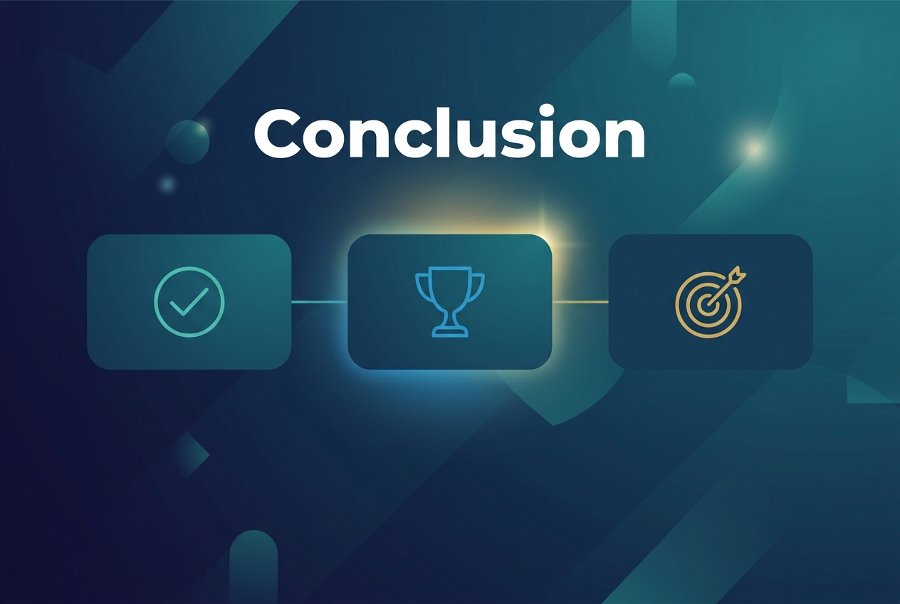
Create a full-bleed 3:2 landscape infographic with a clean professional corporate style. Use a deep navy-to-teal gradient background with subtle abstract geometric shapes and soft light accents. Place a large bold white heading at the top center that reads "Conclusion". Below the heading, create a wide horizontal center section with three evenly spaced rounded rectangular blocks across the page, each containing a simple flat icon: a checkmark in a circle on the left block, a trophy on the center block, and a target on the right block. Use matching accent colors of teal, blue, and gold with clean line icons. Add thin connecting lines between the three blocks to suggest a final summary flow. Include a subtle glowing highlight behind the center block. Use modern sans-serif typography, strong visual hierarchy, and generous spacing. Keep the layout wide and balanced, with no inset frame or vertical poster composition.

2026 is not the year to keep experimenting randomly — it’s the year to get deliberate. The clearest signal from everything covered here is that the teams and educators who will lead aren’t the ones with the most tools, but the ones who use them with purpose. That means treating AI as a power tool with guardrails, putting change management at the center of every rollout, and redesigning assessment so learners show their thinking, not just their answers. It means re-centering SMEs where their judgment matters most, building micro-credentials that stack into real pathways, and making accessibility a default rather than a last-minute fix.

Above all, it means protecting what no algorithm can replicate — human connection, credibility, and community. As the movement toward making every day a digital learning day continues to grow, the goal stays the same: learning that is equitable, engaging, and visibly useful in the real world. Whether you start by redesigning two assessments, launching an AI literacy framework, or simply mapping how your micro-credentials stack, the time to act is now. You don’t have to overhaul everything at once — but you do have to start.


Tags:
academic distinctionacademic successAI in educationdigital distractiondigital educationDigital Learningdigital skillsE-Learningeducational technologyeffective studyingfocus techniqueslearning in 2026learning strategieslifelong learningmodern educationOnline Learningonline studentProductivity Tipsstudent productivitystudent successstudy motivationstudy smarterstudy tipsTime Management
Share on:
Why 90% of People Never Finish Online Courses And How to Fix It
How Successful Students Use Technology to Learn Better in 2026

Leave a Reply Cancel reply

Your email address will not be published. Required fields are marked *

Latest Post

Thumb
How to score 11 A grades and
August 3, 2026
Thumb
How Successful Students Use Technology to Learn
August 3, 2026
Thumb
From Distraction to 100% Distinction: Mastering Digital
August 3, 2026

Categories

  • Blog

Get online courses with acanex. Including GCE O and A Levels

Tags

academic success affiliate marketing AI freelancing AI in education best microphone 2026 content creator tools digital education Digital Learning digital marketing digital skills E-Learning educational technology effective studying financial freedom focus techniques freelance writing freelancing in 2026 lavalier mic learning in 2026 learning strategies make money online online business online business ideas online freelancing online income ideas Online Learning passive income passive income ideas portable microphone remote income remote work SEO content strategy SEO growth hacks SEO trends 2026 social media manager student productivity student success study motivation study smarter study tips virtual assistant jobs wireless microphone work from anywhere work from home work from home jobs

Latest Post

Thumb
How to score 11 A grades and
August 3, 2026
Thumb
How Successful Students Use Technology to Learn
August 3, 2026
Thumb
From Distraction to 100% Distinction: Mastering Digital
August 3, 2026

Categories

  • Blog

Tags

academic success (3) affiliate marketing (2) AI freelancing (2) AI in education (2) best microphone 2026 (2) content creator tools (2) digital education (2) Digital Learning (3) digital marketing (4) digital skills (3) E-Learning (2) educational technology (3) effective studying (2) financial freedom (3) focus techniques (2) freelance writing (2) freelancing in 2026 (2) lavalier mic (2) learning in 2026 (2) learning strategies (3) make money online (6) online business (5) online business ideas (3) online freelancing (3) online income ideas (2) Online Learning (3) passive income (5) passive income ideas (2) portable microphone (2) remote income (2) remote work (4) SEO content strategy (2) SEO growth hacks (2) SEO trends 2026 (2) social media manager (2) student productivity (2) student success (4) study motivation (3) study smarter (3) study tips (3) virtual assistant jobs (2) wireless microphone (2) work from anywhere (2) work from home (3) work from home jobs (2)

acanex

https://acanex.com/wp-content/uploads/2026/03/acanexbusiness-video.mp4

acanex online education.

online students

acanex, the future of online education

Teacher

Ready to give the best to our subscribers

Best Online Learning Platforms in Cameroon – Acanex staff helping students with online courses, exam preparation, and certifications in a flexible learning environment in 2026.

Calender

August 2026
M T W T F S S
 12
3456789
10111213141516
17181920212223
24252627282930
31  
« May    

Join acanex to an exciting digital future

acanex logo3

Experience education without limits. Dynamic online learning built for today’s fast-paced world.

Add: Yaounde_Cameroon
Call:
Email: info@acanex.com

Online Platform

  • All Intructors
  • Contact Us
  • About Acanex
  • User Account
  • Reset Password
  • Forgot Password

Links

  • User Login
  • User Register
  • My account
  • Checkout
  • Cart
  • Instructor Registration

Social Media

Enter your email address to register to our newsletter subscription

Icon-facebook Icon-linkedin2 Icon-instagram Icon-twitter Icon-youtube Tiktok
Copyright 2026 _acanex_All Rights Reserved
acanex.comacanex.com
Sign inSign up

Sign in

Don’t have an account? Sign up
Lost your password?

Sign up

Already have an account? Sign in